
Living room color schemes are getting richer and more layered
April D. Lee | Daily Inter-Lake | UPDATED 2 months, 2 weeks AGO
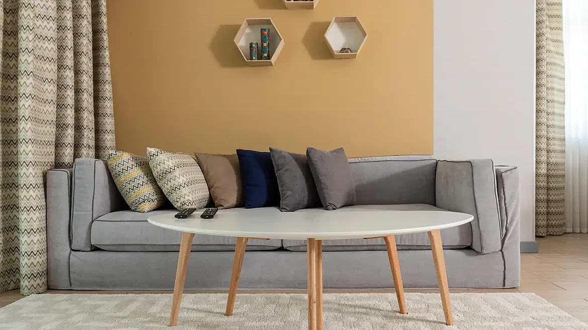
Living room color schemes are becoming warmer, deeper, and more layered. Homeowners are combining earthy shades, richer accents, varied textures, and natural materials to create rooms that feel comfortable, personal, and visually balanced.
A living room can feel technically finished and still seem like something is missing. Walls may be freshly painted. Furniture may coordinate.
Every item may have a place. Yet a room built around one flat neutral can lack the warmth people want from the space where they relax, gather, and spend much of their time.
Designers are moving toward palettes with more character. Warm browns, muted teals, mossy greens, vintage pinks, deep blues, and earthy reds are appearing beside softer neutrals.
Richer palettes do not require every surface to make a statement. Careful layering creates the stronger effect.
What Is the Most Popular Color for a Living Room?
White remains one of the most widely used living room colors because it is flexible and works with many decorating styles. Popular neutral whites continue to offer a versatile backdrop for:
- Furniture
- Artwork
- Stronger accent shades
Popular does not always mean current, however. Cooler whites and icy grays are losing some appeal as homeowners look for greater warmth. Designers are instead using:
- Creamy whites
- Soft ivories
- Muddy greens
- Muted teals
- Plaster pinks
- Warm browns
A warm white can still serve as the main color theme. Richer shades can then appear through:
- Seating
- Window treatments
- Art
- Rugs
- Wood
- Decorative objects
Which Color Combination Is Best for a Living Room?
The best color combinations balance a dominant shade with supporting colors that create depth without competing for attention. Decorilla recommends the 60-30-10 approach as one useful guide. About 60% of a room can feature the dominant color, 30% can use secondary shades, and 10% can introduce a stronger accent.
No formula needs to become rigid. A room can contain many related shades when their undertones and visual weight work together.
Strong combinations can include:
- Chocolate brown, cream, and dusty blue
- Olive green, warm beige, and muted burgundy
- Deep teal, camel, and soft pink
- Terracotta, warm white, and moss green
- Plum, walnut brown, and muted gold
Successful palettes rely more on relationships between colors than on a strict number of shades.
Richer Color Does Not Have to Mean Darker Rooms
Deep color often gets associated with dark, dramatic interiors. Current color schemes show a more flexible approach.
Country Living highlights both warm jewel tones and lighter rich hues for 2026. Deep blues, emerald greens, warm reds, muted teals, browns, and greens can all create depth without making a living room feel heavy.
Related colors can move across walls, millwork, upholstery, and textiles instead of relying on sharp contrast. Earthy greens, warm browns, mineral shades, deep blues, plum, oxblood, and merlot tones are among the colors designers are exploring.
Homeowners can use the same idea on a smaller scale.
Start with one grounded base color. Add lighter and darker versions nearby. Bring in one contrasting accent for energy.
Layering Gives a Palette Depth
Paint creates only one layer of a room. Furniture, flooring, textiles, window treatments, art, lighting, wood, stone, and metal also affect how color is perceived.
Begin with fixed elements, such as flooring, stone, cabinetry, or other features that are difficult to change. A lead color can then connect the surrounding palette.
Texture becomes equally important. Mixing rough and smooth, matte and subtly reflective, or structured and relaxed materials can create depth even within a restrained neutral palette.
A living room may combine:
- Matte painted walls
- Linen or textured upholstery
- Warm wood furniture
- Woven window treatments
- Ceramic accessories
- Patterned modern rugs that repeat several room colors
Repeated tones help separate pieces feel intentional rather than random.
Warm Earth Tones Are Becoming Stronger Foundations
Cool gray once served as a default base in many living rooms. Warmer shades now provide an alternative.
Natural colors also fit well with sustainable interior design because an enduring palette can work with wood, stone, woven fibers, vintage furnishings, and other materials that do not depend on short-lived visual fads. An eco-friendly interior can also focus on keeping useful furnishings and adjusting the surrounding palette instead of replacing an entire room. New paint, textiles, artwork, or smaller accents can change how existing furniture relates to the space.
Lighting Should Guide Paint Decisions
Color changes throughout the day. Morning light, afternoon sun, lamps, and overhead lighting can all affect undertones.
Smart paint ideas begin with large samples rather than tiny chips. Place samples near flooring, furniture, trim, and major windows.
Northern or dim rooms may benefit from warmer undertones. Bright rooms can often support deeper or cooler shades without feeling closed in.
Frequently Asked Questions
How Can You Add Rich Color Without Repainting the Entire Living Room?
Start with movable elements. Curtains, pillows, throws, lamps, artwork, and upholstered chairs can introduce deeper colors without changing every wall.
Choose two or three accents connected to colors already present in flooring or furniture. Repetition matters.
A burgundy pillow feels more intentional when a similar tone appears in artwork or a patterned textile. Smaller changes also make experimentation easier before committing to a larger update.
Should the Living Room Match the Colors in Nearby Rooms?
Exact matching is unnecessary. Connected rooms often look more cohesive when they share an undertone, material, or repeating accent.
A moss green living room could connect with a nearby cream hallway through warm wood and brass details. Repeating one subtle element creates continuity while allowing each space to maintain its own identity.
Can Neutral Living Rooms Still Look Layered and Current?
Yes. Neutral rooms gain richness through variation rather than strong color alone.
Mix cream, camel, mushroom, warm white, and soft brown instead of relying on one beige shade. Add linen, wood, stone, woven fibers, and varied finishes. Designers increasingly use texture and subtle tonal shifts to prevent neutral interiors from appearing flat.
Create Richer Color Schemes With Thoughtful Layers
Living room color schemes are becoming less dependent on one safe shade and more focused on depth, comfort, and personality. Warm neutrals, earthy greens, richer browns, muted jewel tones, and layered materials can make a room feel collected without making it overwhelming.
Explore our other guides and articles for more practical home, design, and lifestyle insights.
This article was prepared by an independent contributor which helps us continue delivering quality content to our audiences.